

3. Use color psychology
- Using contrasting colors can draw attention to what is important
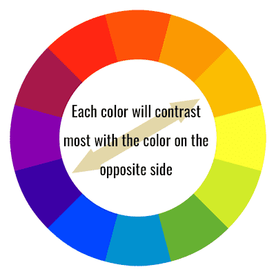
Draw the viewer’s eye to what is important with contrasting color and intensity. Use a color wheel to be sure that your important items jump out. But don’t try to make everything jump out -only the few most important items.
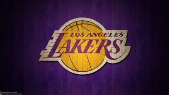
The Lakers logo put’s yellow orange against a bluish purple, two colors that are (for the most part) directly across from each other on the color wheel.
- When describing the color of a product to customers, the name of the color matters.
“Mocha” sells more than “brown”, for example.
- Different colors illicit different connotations among viewers.
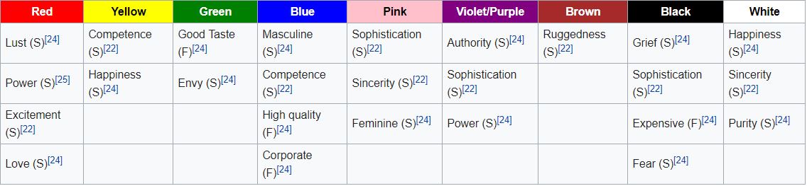
Studies also show…
- When asked to rate color pair preference of preselected pairs, people generally prefer color pairs with similar hues when the two colors are both in the foreground; however, greater contrast between the figure and the background is preferred.[26]
- A study for Nike shoes suggested that companies should consider minimizing the number of colors visible and using similar hues in any one product.[28]
- Blue is the top choice for 35% of Americans, followed by green (16%), purple (10%) and red (9%).[8]
Leave A Comment